Luma — App Interface
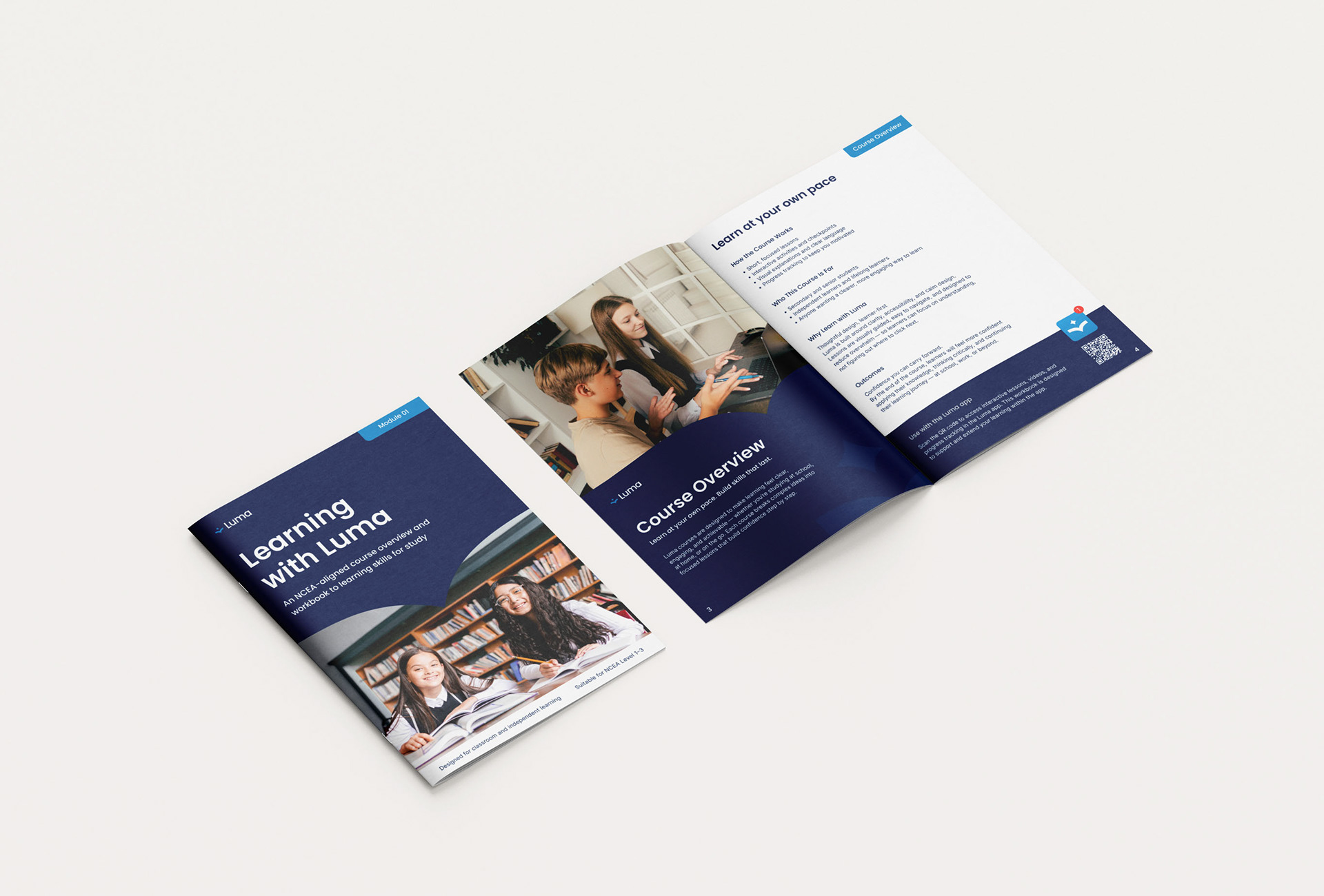
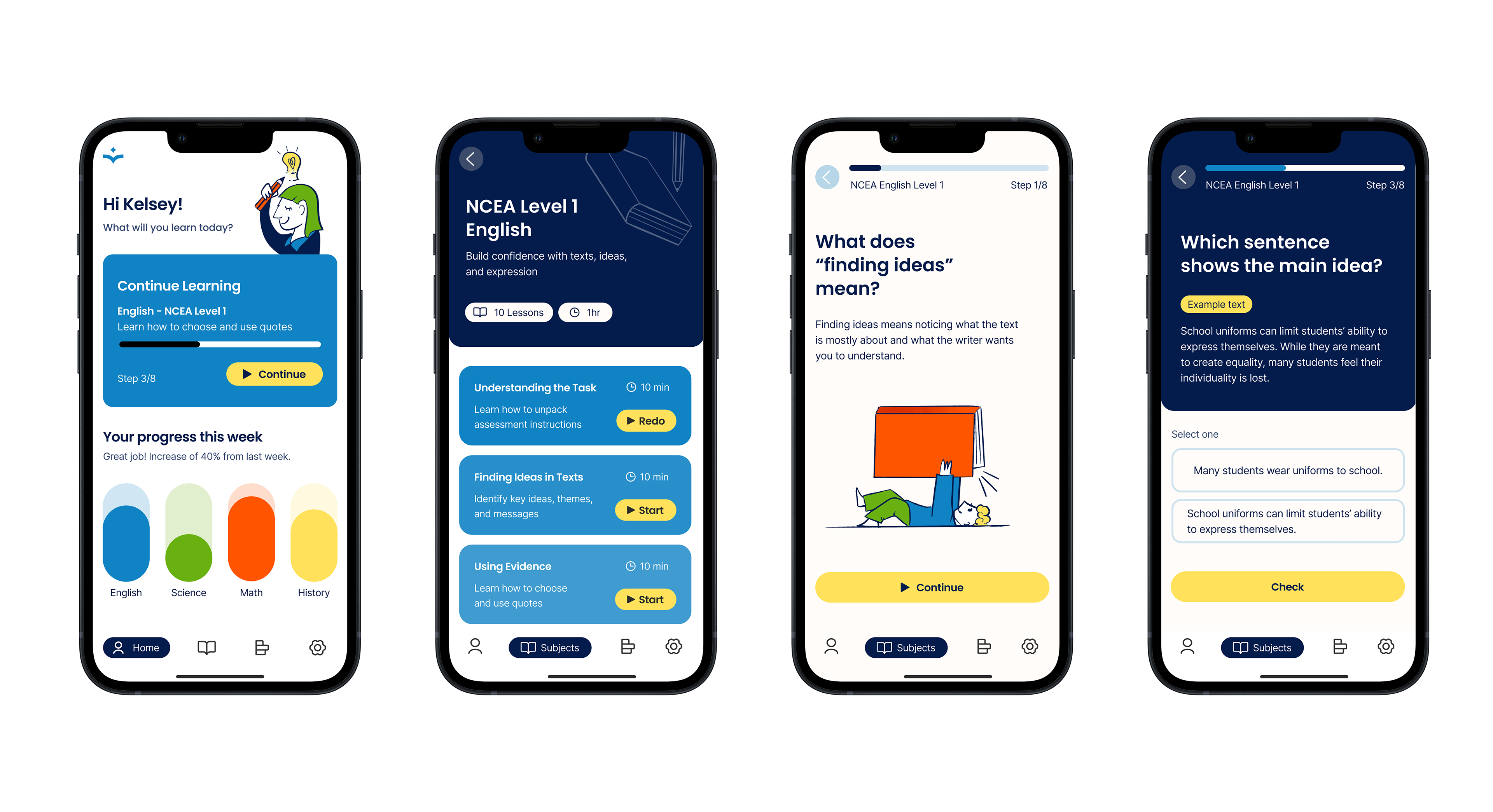
Luma is a conceptual digital learning platform designed to improve student engagement and comprehension through clear visual communication and accessible design. Responding to the problem of text-heavy, visually overwhelming education tools, the brand centres on calm structure, strong typographic hierarchy, and generous spacing to reduce cognitive load.
Luma — Branding
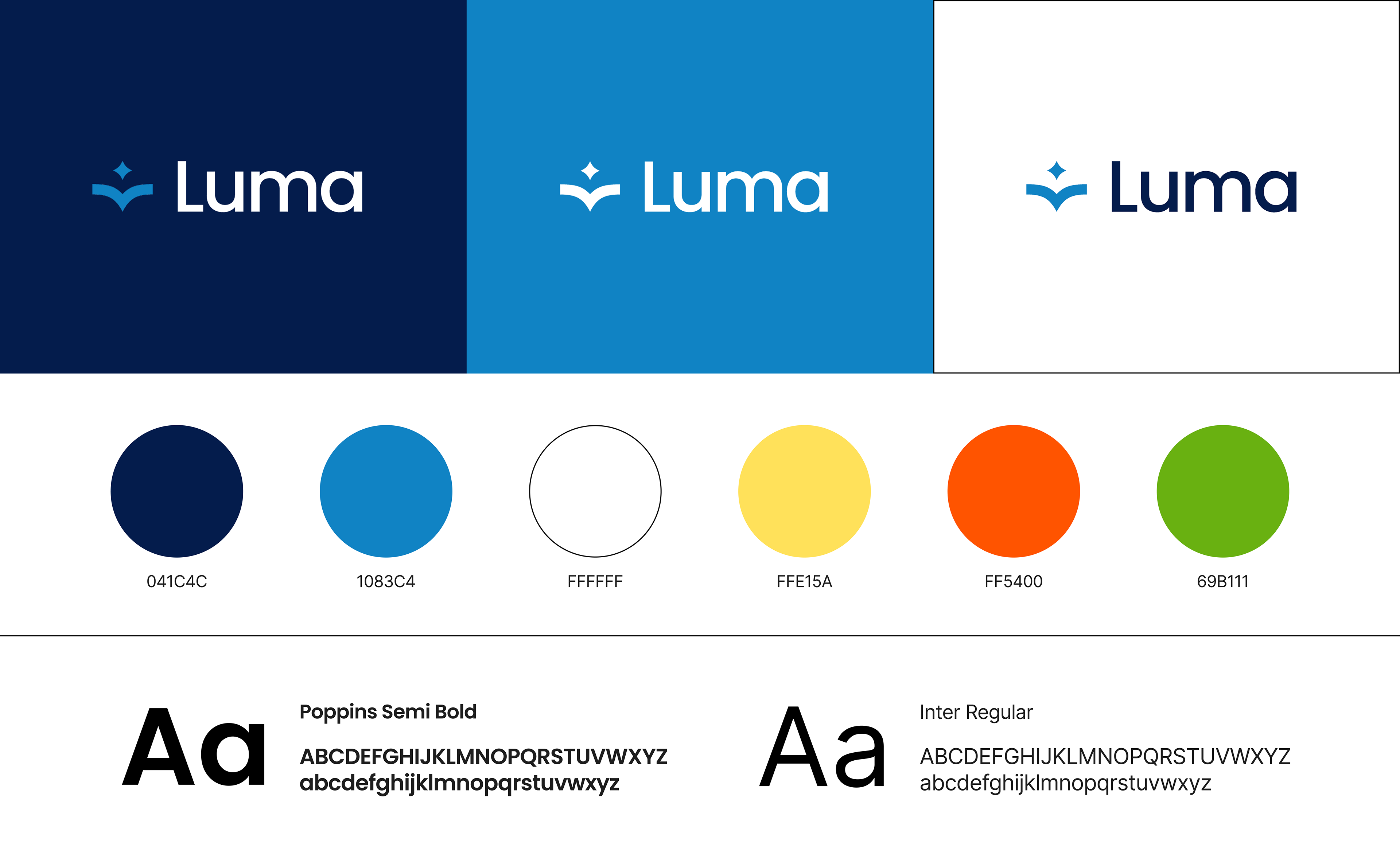
Poppins SemiBold is used selectively for headings and navigation to guide attention. At the same time, Inter Regular supports extended reading and on-screen legibility, and is accessibility friendly for students with learning challenges.
The colour palette establishes a clear hierarchy with dark navy, blue, and white serving as the primary brand colours. This core trio creates a professional, trustworthy foundation. The secondary palette of yellow, orange, and green functions as accent colours for marketing materials and visual interest. These vibrant hues create warmth and approachability in the brand, making Luma feel less institutional and more inviting.
The colour palette establishes a clear hierarchy with dark navy, blue, and white serving as the primary brand colours. This core trio creates a professional, trustworthy foundation. The secondary palette of yellow, orange, and green functions as accent colours for marketing materials and visual interest. These vibrant hues create warmth and approachability in the brand, making Luma feel less institutional and more inviting.


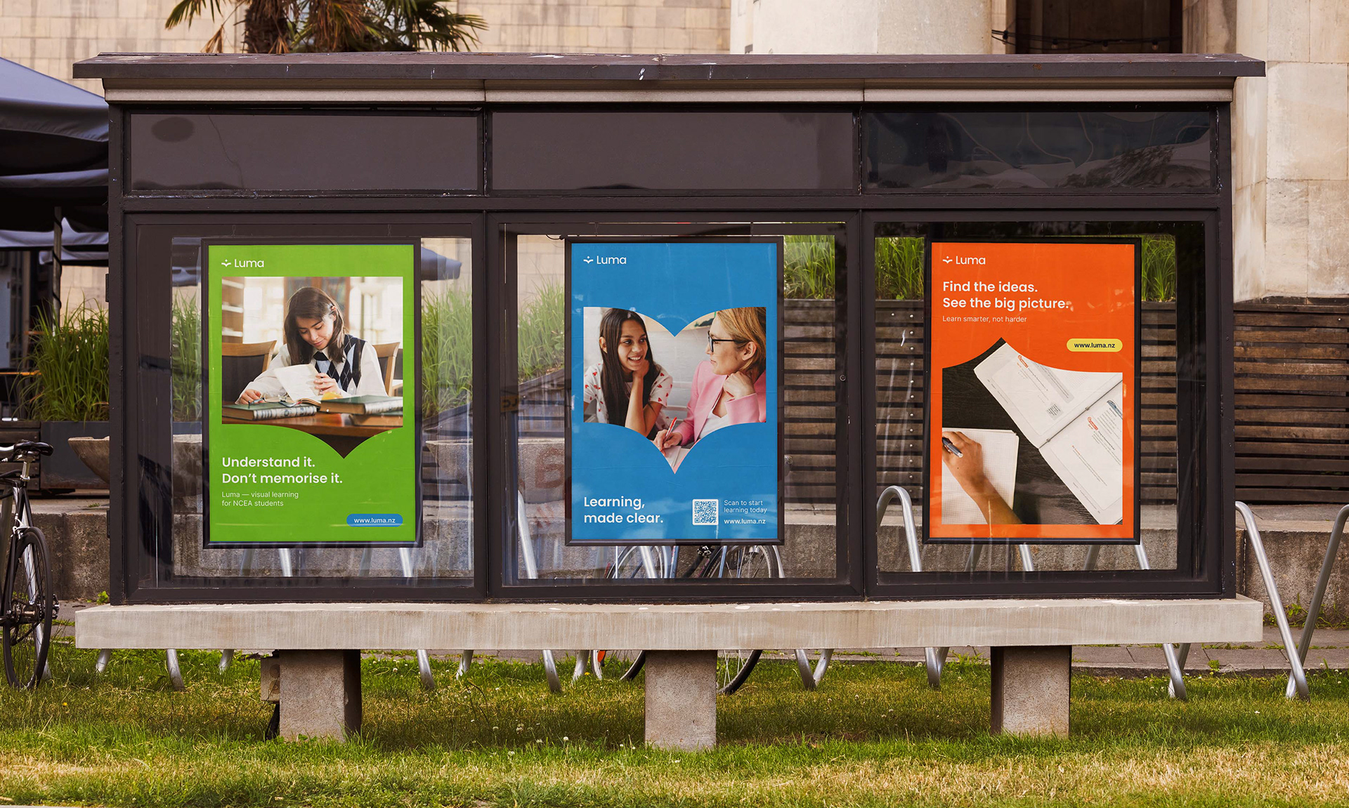
A Standout to Competition
The ad series uses vibrant colours and clever wordplay to create an approachable, relatable feel that breaks away from the traditional academic-heavy tone of competing platforms. This positions Luma as a supportive and accessible learning platform that feels less intimidating and more inviting.